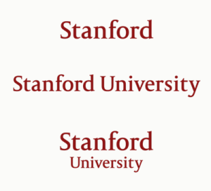
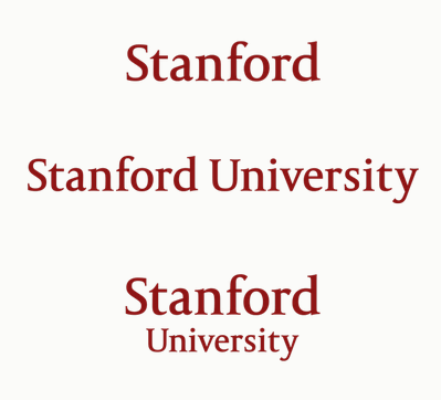
Stanford began slowly rolling out a new wordmark to be placed on all University-affiliated websites and promotional materials last week. Reactions to the font on social media were overwhelmingly negative.

The Stanford signature, or logo, will use a new free, open-source font designed by a team to mimic the curves of the Main Quad, according to University Spokeswoman Lisa Lapin. The University paid a licensing fee for the previous font used.

The new wordmark will be complemented by two new fonts, Source Sans Pro and Crimson Text, to be used in print and online communication. The website of the new “Stanford identity” instructs users to treat the new signature “as artwork, not as typography.”
The Stanford signature is the “uniquely drawn set of typographic characters that symbolize Stanford University.”
The signature will be the only changed symbol — the Block “S,” Block “S” with tree and University seal will remain the same.
Why the font was changed
According to Lapin, complaints were received that the old signature did “not reproduce well in signage, [was] not readable from a distance in banners,…not readily compatible with some of our lengthy campus unit names and [was] particularly challenging to sew onto clothing.” It also was unsuited for small format on mobile devices.
The new signature is “clearly legible” in different sizes and formats, according to Brad Hayward, senior director for strategic communications.
“The principle for us really is the flexibility of usage and its applicability in the digital environment first and foremost,” Hayward said.
The new signature is also intended to allow various University departments to adapt their logos to limited space. Hayward noted that the design incorporated “the feedback of those who have commented on the limitations of use” of the old logo.
The word “University” was also dropped from the new wordmark to allow for versatile application.
The open-source fonts used in the new design also mean it is now cheaper, but Hayward said that removing usage limitations was the priority rather than economic reasons.
“I think it’s important for people to understand the reasons the change was undertaken: both to increase the flexibility of usage for people across the University community who need to associate their individual programs with the larger Stanford identity and also for ensuring that the Stanford mark is clear and legible and functional in the digital environment,” Hayward said.
In a statement, Lapin said the change “was absolutely intended to be a significant cost saving to the University.”
The new wordmark was a result of collaboration by the Office of the Provost, University Communications and Business Affairs. Bright, a design firm based in Marina Del Rey, Calif., created the new logo. The firm has designed for UCLA, the Grammys, Muscle Milk and Safeway. It was chosen by following what Lapin called an “extensive RFP [Request for Proposal] process.”
President John Hennessy and Provost John Etchemendy selected the new wordmark from a variety of options presented to them, according to Lapin.

Rolling out the new font
The new wordmark is being rolled out on a gradual basis with no timeline for the University as a whole. The identity website was announced on Oct. 25 and some University-wide websites have incorporated the new fonts.
These include the University homepage, Stanford Arts, Stanford News Service, Stanford Nobel Laureates and the new Identity website.
“The various schools and departments and programs are, on a voluntary basis, able to begin incorporating the updated identity as they see fit,” Hayward said. “That means, as they are comfortable with and ready to move into using the new, updated identity, they can do so in their websites, their printed materials and the like.”
Lapin said response has been “overwhelmingly positive,” particularly from campus units, noting that her office had received praised from members of the “global design community” describing the new wordmark as a “fresh, modern and versatile solution.”
This is in stark contrast to the majority of reactions from students and alumni on Twitter and Facebook, which have largely panned the font as childish and unattractive.
Kurt Chirbas contributed to this report.
This article has been updated to reflect that the new wordmark will be complemented by two new fonts.
http://storify.com/MarwaFarag/reactions-to-stanford-s-new-typeface
