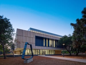
After almost two years of construction, it’s finally happened: The Anderson Collection is open to the public. On opening day, visitors were directed by a simple, makeshift sign to the new building and met by museum staff, accompanied by a string quartet. Although the procession to the building was pleasant, its understated nature did not do justice to the incredible building and collection within. But then again, I’m not sure what could.
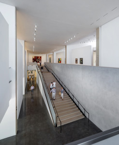
As I walked into the Anderson Collection for the first time, all the floor plans and Google SketchUp images I had seen a year ago came to life. When I entered, the staircase immediately grabbed my attention. Long and processional, the stairs feel like they run as long as the building is deep. They provide a moment of pause — a period of time to shift your focus from your day-to-day life to the abstract, expressive nature of the collection, the majority of which is on the second floor. This moment of pause also allows the visitor to appreciate the architecture of the building, before it intentionally takes a backseat to the artwork on the second floor. Simple, clean, and elegant, this understated building never distracts from the artwork.
When I arrived at the top of the stairs, I felt drawn into the rectangular loop of the second floor. With no true beginning or end, you can begin your journey with the first piece that catches your eye.

On the second floor, simple, expansive walls serve as a home to magnificent pieces by artists like Mark Rothko, Jackson Pollock and Willem de Kooning. The building successfully accommodates the expansive 121-piece collection while still giving each piece space to breathe. The design of the building also highlights the artwork through its unique lighting system. By using advanced light sensors, the clerestory always lets in a steady amount of natural light. No matter the time of day or direction of the sun, the gallery stays uniformly lit at all times.
When I was leaving the building later that afternoon, I couldn’t help but recall the conversation I had last year with University Architect and Director of Campus Planning and Design David Lenox. “(We) are creating synergies in unique areas of campus,” he told me. While this incredible building and collection have found their permanent home, it takes people to create synergy in a space. Although the gallery was by no means empty on opening day, I was still disappointed that it wasn’t busier and livelier. So if you have an afternoon, an hour or even thirty minutes, stop by the Anderson Collection and be a part of making an incredible space come alive.
Contact Mary Carole Overholt at mco95 “at” stanford.edu.
