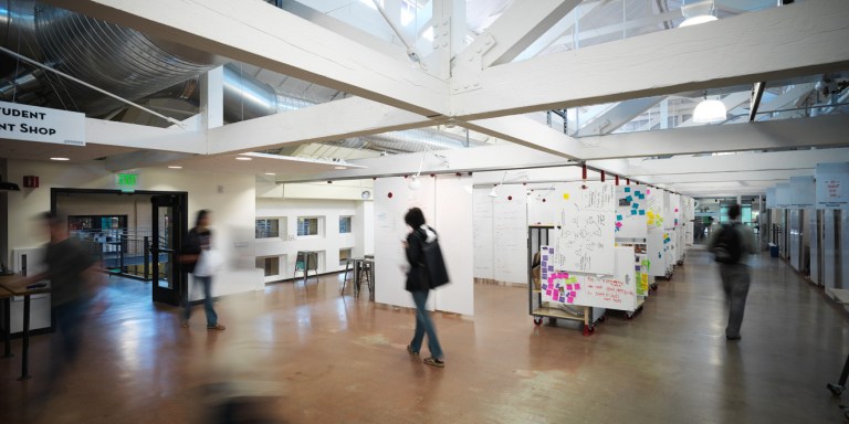
Less than a year after renovating Stanford’s Institute of Design (the d.school), Cody Anderson Wasney Architects have been showered with praise. From positive student and faculty feedback about the building, to the recent Citation Award at the American Institute of Architects’ 2014 Santa Clara Valley Design Awards, the building has already made a statement both on and off campus.
According to Chris Wasney, principal architect at Cody Anderson Wasney, the architect-client relationship in the d.school project had been different from the norm since day one. The d.School seemed “less [like] our clients and more [like] our collaborators,” states Wasney about the d.school team.
Though Wasney stated that they eventually fell into the firm’s normal project cycle, the architects initially adopted the d.school approach to design in reimagining the d.school building. Wasney noted that this involved “a very long period of trying to understand the nature of the problem and the needs of the users, followed [by a] continuous cycle of prototyping and assessment, with multiple iterations.”
During this cyclical phase of ideation and prototyping, Wasney and d.school faculty addressed the critical d.school need for easily adaptable spaces that would facilitate the ability to have both small groups and large groups working in the same space. The second floor studios of the building have sliding and hanging panels that can partition off spaces for small and medium sized groups. These can also be easily retracted to create a larger group setting. The central atrium was also designed as a highly flexible room, able to host presentations, events, project groups, and even informal gatherings.

The Stanford d.school cherishes the idea of radical collaboration — bringing together individuals with many different backgrounds and perspectives to address a design problem. With exposed interior balconies, walkways and, as Wasney puts it, spaces that “tend to interlock, and blend into one another, rather than be separated by fixed, opaque walls,” the building fosters radical collaboration. This helps to ensure that design groups are never isolated from one another in the d.school but rather constantly in dialogue with one another.
While the dynamic interior of the building accurately reflects the progressive design ideas of the d.school, the façade respectfully pays tribute to its place at Stanford. Instead of using a glass façade to expose the unparalleled work going on at the d.school to passersby, the façade is created out of the same sandstone and tile roof used all around campus. Though this choice may seem mundane, it was actually a point of excitement for Wasney. “You may notice that the façades facing into the interior atrium are clad in sandstone and stucco — their original materials when they were actual exterior facades.” Wasney added, “These materials, especially the beautiful stone, had been entombed beneath drywall and paint for decades — it was a thrill to uncover and restore them.”
Contact Mary Carole Overholt at mco95 ‘at’ stanford.edu.
