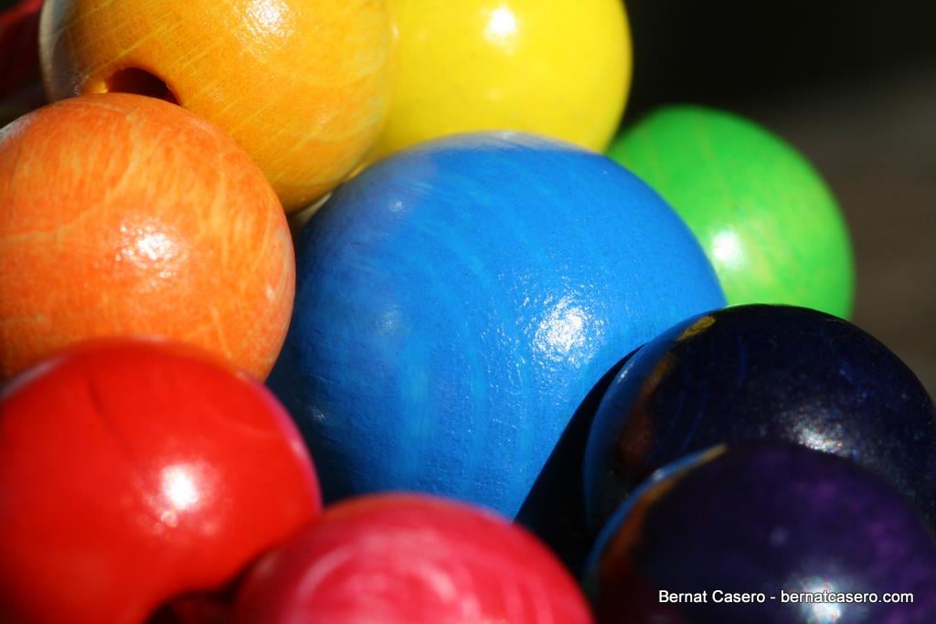
Colors come together for more than just the rainbow flag or paint swatches. The meanings we associate with them create a virtual how-to map for company branding. In this Silicon Valley environment of innovation, the colors chosen for startup logos are just as important as, if not more than, the idea itself.

Here is a quick color breakdown for entrepreneurs to keep in mind as you come up with your startup’s new logo, as well as an idea of how saturated is each color’s market:
Red
My favorite color by far, red is always associated with excitement and vibrance. Think of company’s like Coca Cola, Yelp and CNN. These brands are associated with youthfulness, constant change and evolution. By choosing red, you’re targeting a dynamic audience that is also open to change. Second to one other color, the market for apps with red logos is highly saturated. Any entrepreneur attempting to gamble may have their product lost in the shuffle.
Orange
If you’re looking to convey similar emotions and concepts as red, but want to stray away from that concentrated market, orange is a great alternative. Although fewer companies (outside of the orange juice folks, obviously) use the color, it is becoming more popular. Think of Home Depot, Nickelodeon and Shutterfly. Characteristics like creativity, friendliness and enthusiasm come to mind.
Yellow
Brands like Sprint, McDonald’s and Shell have made yellow their go-to color. The color conveys feelings of optimism, warmth and pleasure. I often associate some sort of familial sentiment with the color as well. Apps sporting this color should keep these varying characteristics in mind. Though the market provides some flexibility, the varying hues of yellow will present some complications as darker and lighter shades may elicit or convey alternative responses.
Green
Starbucks and Whole Foods are donned in green. If not obvious, green has come to be associated with sustainability, both in the tree hugger, garden-towing sense and the Tupperware, save for later sense. Green also screams money and wealth (see companies like H&R Block and Ameritrade) making it perfect for those targeting the fiscally conservative. If your service does not fit squarely into either of these camps, green is not the color for you.
Blue
Almost every app and company known to man seems to use blue—Facebook, Tumblr, Skype, LinkedIn, Chase Bank, etc. Objectively the most popular color, it’s often paired with terms like stability, truth, precision and intelligence, but also very much carries corporate associations. Often perceived as a masculine color, logos for companies aiming to exude strength may want to employ this color. The downfall however is that the competition, looking at color alone, is steep with more recognizable brands Twitter and HP.
Purple
Few companies have the courage to delve into the purple family. Often associated with kings and queens, royalty most readily comes to mind, but as the color wheel reminds us, purple takes the best of both the red and blue worlds. Imaginative and wise is closely associated with the color. With brands like Hallmark, Yahoo and Willy Wonka subscribing to purple, any daring app has much more room to be visually refreshing.
This post was originally published on thedishdaily.com before it was acquired by The Stanford Daily in summer 2014.
