While it’s easy to get excited about the soon-to-be finished buildings of 2015, it’s important to take a step back and look at the many groundbreaking steps architects have taken over the course of the past year. Many new buildings opened this year, but the most successful ones pushed the envelope of how people can experience and identify with architecture. Here’s a look at five of the most functionally, experientially and aesthetically innovative buildings opened in 2014.
Founded in 2010, Nameless Architecture is already making a name for itself in the design world. With their Triangle School in Namyangju, South Korea, the husband-wife architect duo of Unchung Na and Sorae Yoo created a thoughtful response to a triangular site. Instead of ignoring the shape of the site, Na and Yoo embraced it and created a triangular building. The triangle school has three façades, responding to the three different external contexts facing these façades: a playground, an existing building and sloped terrain. Nameless Architecture was able to create a complex, dynamic building with just simple geometry.

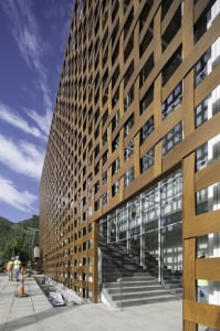
From the moment the Aspen Art Museum opened its doors last August, one thing was for sure: This building was the work of Shigeru Ban. In his usual fashion, Ban built the Aspen Art Museum as more of a community center than a traditional museum. Instead of a grand foyer, the rooftop deck of the museum serves as an open community space. With views of the surrounding mountains, the deck invites not only lovers of art, but also lovers of nature into the museum.

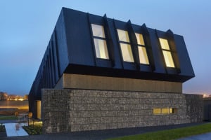
Created in conjunction with The Research Center for Zero Emission Buildings (ZEB), Snøhetta’s ZEB Pilot House is more than just a self-sustaining building; it’s a “plus dwelling,” producing more energy than it uses. The only residential building on my top five list, the ZEB Pilot House proves that energy-efficient buildings can also be aesthetically pleasing. Though the roofline is slanted to increase the solar panels’ exposure to the sun, Snøhetta turns this gesture into a defining aesthetic aspect of the building.
In designing the Szczecin Philharmonic, Estudio Barozzi Veiga began with a deep analysis of Szczecin’s traditional Scandinavian buildings, which are notable for their high-pitched roofs and vertical details. Inspired by this research, Estudio Barozzi Veiga created the unique roof of the Szczecin Philharmonic, which is dominated by vertical peaks. The angularity of the exterior is continued in the main auditorium, with ceilings and walls dominated by patterns of geometric forms, mimicking the rhythm of the music played within. Today, the Szczecin Philharmonic stands as the product of Estudio Barozzi Veiga’s meditation on Scandinavian architecture and rhythm.

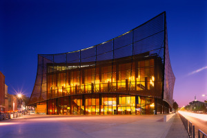
Mimicking other buildings in Albi, France, Dominique Perrault Architecture created the Albi Grand Theater as a rectangular mass, wedged between the perpendicular avenues next to it. By adopting this long-standing, local, architectural move, Dominique Perrault Architecture was able to take advantage of these roads’ dense pedestrian traffic. While the building’s placement seems rather expected, its light, copper-mesh exterior is a great departure from the surrounding brick and tile roofed edifices, defining the Albi Grand Theater as a modern cultural institution.
Contact Mary Carole Overholt at mco95 ‘at’ stanford.edu.
