In 1950, when fine art printmaking was on the brink of a technical renaissance, Dr. Judd and Katharine Marmor began collecting textual prints and became some of the earliest subscribers to Gemini Graphics Editions Ltd., then the premier West Coast destination for innovative printmaking. Their son Dr. Michael Marmor, currently a professor of ophthalmology at the Stanford School of Medicine, graciously donated the cherished family pieces to the Cantor: The first of the series named “Words as Image” is on view until Nov. 6 in the Contemporary gallery at the Cantor.
Historically, texts have been the keys to linking pictorial figurations to deeper abstractions. Elegant imagery-based pictorials that make up much of the characters in written Chinese and fractal Arabic are living manifestations of how visual texts shape human thought-pathways. American concept artists did not begin manipulating and materializing written language until the early 20th century, during an explosion in consumerism.
Refreshingly hip artists ranging from Oldenberg to newcomers influenced by Rauschenberg and Rene Magritte make their presence felt in this small but strong exhibit. Oldenberg’s clippings of buildings made of letter blocks and other crazy architectural designs quickly scribbled on napkins during dinner parties find a special place among other mixed media forms. By presenting a diverse palette, the Marmor collection delivers a resounding success in investigating the relationship between language, perception and art.
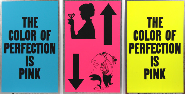
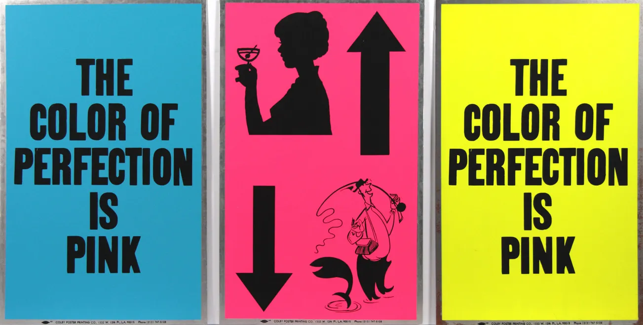
Feminist undertones ring loudly in “The Color of Pink” (1988), three pieces that contain statements reading “pink is the best color” on a pop blue and bright yellow background. Tottering on tasty lollipop colors and putting the physical word pink on a non-pink background, Allen Ruppersberg plays with a psychological occurrence called the Stroop effect. In the classic experiments, Dr. John Ridley Stroop instructed his subjects to read from a list of words printed in black versus incongruent colors. Subjects typically averaged 74 percent longer to name ink colors of incongruent words, suggesting that reading words is automatic while naming colors takes much more effort.
Every other piece in the collection tells its own intimate story.
In “No” (Jasper Jones 1969), a rusty metallic embossing gives the word “No” layers of solidity dangling from a scratchy, yellowed thread. The ambiguity of giving or receiving consent and the declaration of “No” as a conditional statement is made clear. The use of three different metallic inserts — infused copper, brass and aluminum all rusted to different degrees — demonstrates the complexity of that simple word of negation.
“Pay Attention” (Bruce Nauman 1973) displays screaming black letters on scratched glass reading “PAY ATTENTION MOTHERFUCKERS.” Written in a greasy ink called “tusche” on lithographic stone, the lettering is squeezed so tightly together that the core message — demanding the audience’s attention with aggressive expletives — is rendered almost illegible. Ironically, the power thrown into the physical call nearly eclipses any visual processing of the words.
Nauman’s later work, “Raw War” (1971), is a 3D visualization of the word “raw” and its palindrome “war” spatially distanced in receding planes. “Raw” is inked in a savage crimson, like a flesh wound from an opponent’s scimitar in the battleground of the word’s palindrome.
The more abstract pieces in the set recruit the assistance of words in emphasizing textural detail. Jasper Johns blends together shades of gray to create the depths of each of fragmented body part, knee, kidney, torso, feet, all disjointly nailed to wooden strip panels. The labeling in reverse-cursive in a ghastly white ink and the extra time taken to discern each body part adds to the piece’s macabre quality. George Herms’ “Sweetie Bird” features a trash collage of ordinary objects, namely a burnt and stained Christian Hymn sheet topped with an asymmetric felt strip bearing the holy cross in glitter. The artist, adopting a persona, describes it as an unconventional love note to his wife.
The experience of viewing language and the cerebral assigning of strokes on a page to mental meaning is creative in a way that clay, sound and surfaces are not. Noam Chomsky, the great linguist and logician, calls this the “true poetic element.” From the liturgical texts of the Bible, the Quran and manuscripts from the Ottoman Empire, to every advertisement, the subtleties of printmaking manipulate the psyche.
Contact Jennifer Adams at adamsjen ‘at’ stanford.edu.
