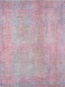
The recently opened “New to the Cantor” features some of the most iconic contemporary and modern pieces from the collection, as well as artists who have never been exhibited at the museum before. Together, these elements combine to form one of the most impactful, visually diverse exhibits I’ve seen during my time at Stanford.
“New to the Cantor” is all about visual impact. That is to say, the exhibition packs a punch. This is achieved through the scale of the exhibits and the individual pieces on display and the artists’ use of shape language and color.
The towering scale of the works, coupled with the the sprawling area of the Freidenrich Family Gallery, shrinks the viewer and builds a wholly immersive experience.
An untitled work by San Francisco-based contemporary artist Barry McGee stitches together 152 elements of acrylic on panel. The piece is an eclectic shock of pattern and glowing color that explodes across the exhibit’s near wall. Typographic elements that read “FONG,” geometric patterns and graffiti scrawl all make cameo appearances. McGee’s work, like several of the other artists on display, leverages the aesthetic of op art and commercial art, bringing to mind the mid-20th-century pop-art movement. McGee’s origins as a graffiti artist are evident here, and it’s fascinating to see how street art culture interacts with the gallery setting.
The inclusion of iconic 20th century American works makes “New to the Cantor” all the more glamorous. Chuck Close’s Zhang Huan II buzzes with Close’s infamous style. Andy Warhol’s red-faced “Mao Tse-Tung” peers unwaveringly across the gallery floor.
Half of the exhibition is devoted exclusively to the works of Los Angeles-based contemporary artist Dashiell Manley, whose works seem to tie together and even shape the themes in the exhibit. Editorial design, abstract fields of color and an imposing sense of scale are all mainstays in Manley’s composition. In his works, Manley choreographs pastel colors, chaotic scribbles and handwritten typography. As I mentioned earlier in my Cantor preview, Manley’s visual language is distinctly and strikingly his own.
Manley’s “Elegy” series is particularly notable for its texture. The series is distinguished by the use of thick, glutinous paint daubs to create motion across the canvas.
“Elegy for whatever (a haystack lit from the back)” headlines the exhibit. The work just exudes horizontal motion – every stroke of paint represents an energy. Cool colors swim to the right, and warm colors swim to the left. Thick clots of paint appear to be extruded from the canvas surface,which helps to further ameliorate the sense of movement.
Manley finds inspiration in editorials and current events. The LA artist morphs scripture from The New York Times into abstract, color-infused clouds. He takes iconography from cartoons and superimposes his own streaks of “vandalism.”
Ultimately, “New to the Cantor,” by displaying the new alongside the relatively old, highlights the cyclical nature of design and the timelessness of powerful shapes and mark-making in art.
Contact Eric Huang at eyhuang ‘at’ stanford.edu.
