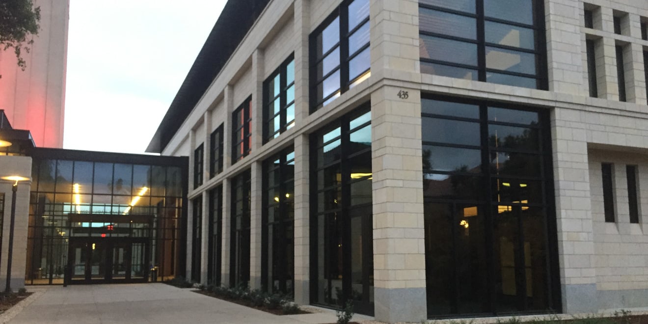
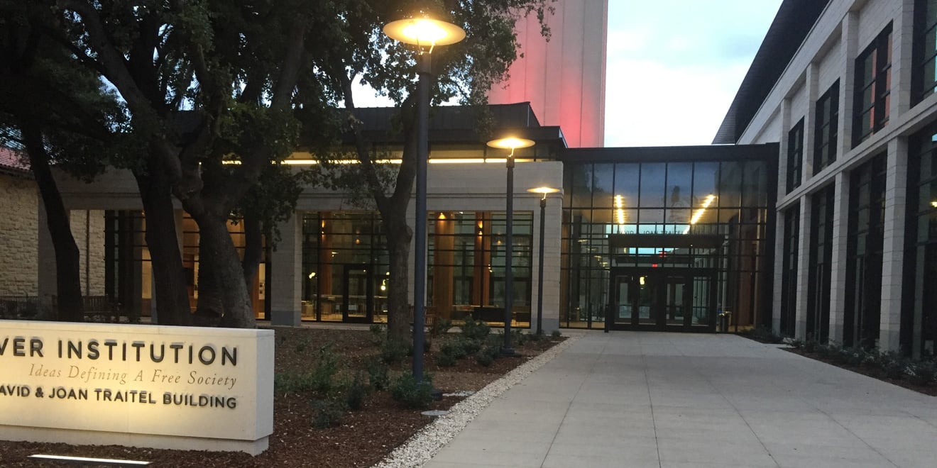
Construction on the David and Joan Traitel Building, which will accommodate the growing Hoover Institution, recently finished after two years. Positioned on the outskirts of Main Quad, the building was designed to adhere to Stanford’s particular modern architectural philosophy.
Designed by the architectural firms William Rawn Associates of Boston and Cody Anderson Wasney Architects of Palo Alto, the building attempts to balance the surrounding context of Stanford’s campus with more contemporary details, according to David Lenox, Stanford’s architect.
“We wanted to fit in but stand out,” said Jeffrey Jones, assistant director of the Hoover Institution, who was instrumental in the design and architecture of the Traitel Building. “You don’t get any closer to the center of campus really and the historic quad, but at the same time we knew it would be a modern building.”
The director of the Hoover Institution, Thomas Gilligan, said he loves the Hoover Institution’s new space.
“I love it from a use point of view,” Gilligan said. “Our overseers, who are the chief support group for the institution, just love coming here.”
Given its location, Lenox said that the Traitel Building mimics many of the design features of the Main Quad — particularly the iconic arcades and courtyards.
“[The] first floor openings reflect the rhythm and scale of the Main Quad arcades,” Lenox said. “The more formal design of the interior courtyard reflects some of the more formal courtyard spaces in the Main Quad.”

Jones also said that the red clay roof and inset windows of the Traitel Building reflect the architecture of the rest of campus. In addition, the dimensions of the white stones that comprise the Traitel Building’s facade are meant to reflect the the sizes of the exterior sandstones of other campus buildings.
Not all aspects of the Traitel Building’s design, however, came out of the desire to match surrounding buildings. For instance, one important part of the new building is its emphasis on natural light; there are even windows in the auditorium.
“We knew we wanted to have a lot of natural light,” Jones explained. “That was really key for us.”
According to Lenox, there is also symbolic meaning behind the many windows on the Traitel Building’s facade.
“More exterior glass allow[s] views to the interior spaces,” which Lenox said sends the message that “the Hoover Institution invites interaction and will continue to find ways to connect to the University.”
As more new buildings are constructed, Lenox said, consistent design principles will continue to guide the architecture process.
“Our objective is to have a campus that continues to feel aesthetically cohesive, inspiring, and reflects the Stanford ethos,” Lenox said.
Jones also said it is important that new buildings are located so as to correspond with the existing campus layout. According to Jones, Meyer Library was taken down partly because it did not fit in with the planned campus design.
“[In the 1960s] there were buildings…that really disrupted the natural flow of the original plan and the views,” Jones said. “I think that a lot of what’s driving the future buildings and where they put them is continuing to build quads as you move out from the center of campus but following that design etiquette.”
Contact Claire Dinshaw at cdinshaw ‘at’ stanford.edu.
