Gothic churches point towards Jerusalem… or do they?
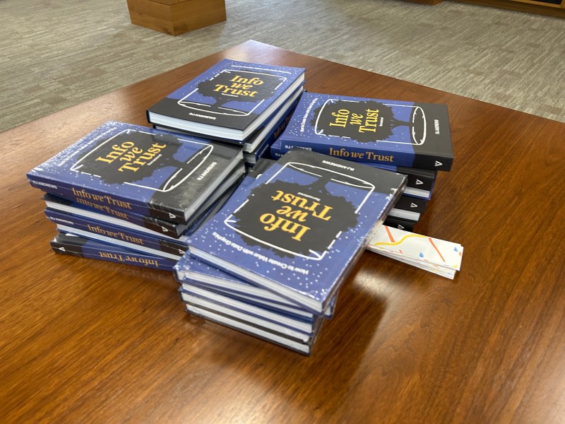
Data storyteller R.J. Andrews put this theory to the test. Andrews discussed his findings, among other adventures and discoveries in the field of information graphics, during the launch of Andrews’ new book, “Info We Trust,” at the David Rumsey Map Center on Friday.
The event was introduced by Evan Thornberry, the head and curator of the Map Center. Thornberry noted that today’s golden age of information makes well-presented data all the more necessary.
“ We need to be able to interpret it and critically assess how that data is being or will be presented,” Thornberry said.
Andrews’ book attempts to do just that. Its 240 pages discuss the impact of visual organization on our understanding of information — data can be simplified, structured, prioritized and narrativized just by the way it’s laid out on the page. Andrews is the living embodiment of this belief in the power of visual communication. In the event, he presented the way he writes using graphs and visual aids (his own hand-drawn illustrations) to simplify deceptively complex ideas.

Take the aforementioned orientation of Gothic churches. When Andrews displayed the bearings of French Gothic churches on a map, there seemed to be few noticeable patterns (save for the fact that they definitely do not all point in the same direction). When Andrews switched to a horizontal bar chart with degrees on the y-axis, however, it became apparent that their directions were all distributed around East.
“Cathedrals are oriented in a way to face sunrise on a particularly important day during that church’s calendar,” said Andrews. Since the direction of sunrise changes throughout the year, this results in a range of directions.
According to Andrews, data is powerful because it “helps us organize the chaos of the world.” It allows complicated information to be made more intuitive while still reflecting its inherent richness, he said.
Charts make information more apparent than it is at first glance. “ You can’t actually move all these cathedrals around and put them in the same place,” said Andrews. “The magic of information graphics is that they take these things that are real, but that you can’t see, and they bring them into a form that lets us see them.”
To explain this elucidation of murky facts, Andrews referenced Plato’s allegory of the cave: people have the ability to comprehend reality, but because we’re not looking in the right places, we only see the shadows of objects instead of their true forms, he said. Similarly, information graphics aim to show audiences true patterns in the world that may be obscured from view due to the unintuitive way in which they appear.
It is a data storyteller’s job to make choices that best suit the data. Elements like shape (circular or rectangular), direction (usually left to right) or systems of coordinates all subtly encode information that facilitates or obstructs viewers’ abilities to see the underlying patterns.
“Different charts have different purposes because they emphasize different things,” said Andrews, “ The role of designers to [ask the question], ‘How am I showing this data based on what do I want to emphasize?’”.
For Andrews, a key embodiment of such masterful discretion in chart-making can be found in the David Rumsey Map Center itself: Émile Cheysson’s diagram titled “Recettes brutes des théâtres et spectacles de Paris de 1878 à 1889.” The map of Paris overlaid with theatre revenues across different years uses wedges arranged in semicircular “fans” to show the statistics. According to Andrews, the brilliance of this technique lies in that it simultaneously displays time, scale and location in space more efficiently than a regular bar chart.
The lecture was followed by a question-and-answer segment.
Regarding what he considers to be “Golden Ages” for information graphics, Andrews pointed to the pre-World War I period due to the wealth of empires and availability of printing technology. Andrews said he is also fascinated by British isotype publications from the 1930s and 1940s because they predated the institutionalization and standardization of data visualization.
“Everything’s kind of funky. Everything’s weird,” Andrews said.
As for the role of AI in his industry, Andrews hopes technology will fill a crucial gap between the technical ways in which data is created and the humanized, narrativized ways in which they are interpreted.
The presentation was followed by a book-signing event, during which staff members from the Stanford Bookstore sold copies of “Info We Trust.”
