
I walk into the Rumsey Collection for the third and possibly final time in my Stanford career. The collection houses some 150,000 maps sourced and donated by prolific collector and historian David Rumsey. Upon entering the space, you find yourself in a somewhat intimidating room complete with books, exhibits and even a Bellerby Globe. Near the back is a large screen that technicians use to swiftly search through maps. I ask Jessie Kong ’25 for my favorite map: the Golden Square Cholera Outbreak. She looks confused for a moment, before suddenly smiling in recognition.
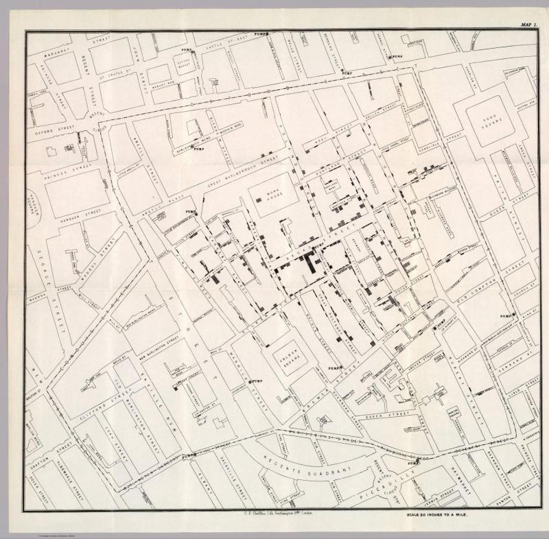
I learned about the map in DATASCI 112, from a guest lecture by the always bubbly Dennis Sun. As the story goes, John Snow was a physician who wanted to understand the spread of cholera. In 1854, the prevailing theory concerned an airborne disease called miasma. Snow plotted the cholera cases in a dot map. He noticed that the Broad Street pump was suspect and followed up with investigative work, which helped establish cholera as a waterborne disease. His discovery was a win for public safety.
Today, all sorts of maps are used to great effect. From Jack Maple and COMPSTAT to Stanford and the Open Policing project, the applications are endless. Even better, maps admit exciting problems.
Consider a vanilla task for the cartographer: label North America. The obvious question is where to center the label.
A first pass is to ask for its geographic center. A simple estimate is to use the center of mass. In 1930, a USGS employee did just that by taking a cardboard cutout of North America and balancing it on Rugby, North Dakota. It was not the most sophisticated setup, but it got the job done, give or take 20 miles. A more faithful estimate would consider the curvature of the Earth. If we do so, we find that the center is hilariously placed in a small town named Center, North Dakota. Of course, the Center has a drawback — it is influenced by mass far away from itself, so the label ends up smaller than it could be.
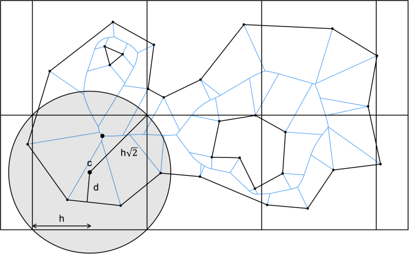
A second pass is to compute the farthest point in the interior, fancifully called the pole of inaccessibility. The PolyLabel Algorithm grids the map and explores promising cells while aggressively pruning uninteresting ones.
And that is just one flavor of problem. From the Coastline Paradox to the Four Color Theorem to the Traveling Salesman Problem, it is clear that maps have captured and inspired the imagination of problem solvers for decades.
But for all this talk about maps and their problems, we overlooked a rather glaring one: we have never actually defined what a map is. It seems like a silly question, but what is a map?
In a conversation, Kong admitted she has learned to accommodate all sorts of maps since working at the Map Center.
“There’s this one brain map, a picture from the 1700s. Someone drew a brain and explained the parts of it…It looks really strange, but that’s in David Rumsey’s map collection…Since I started working at the map center, my definition of maps has become more and more loosely defined.
The map, I argue, stands for something more than a visual display.
A Stanford Map
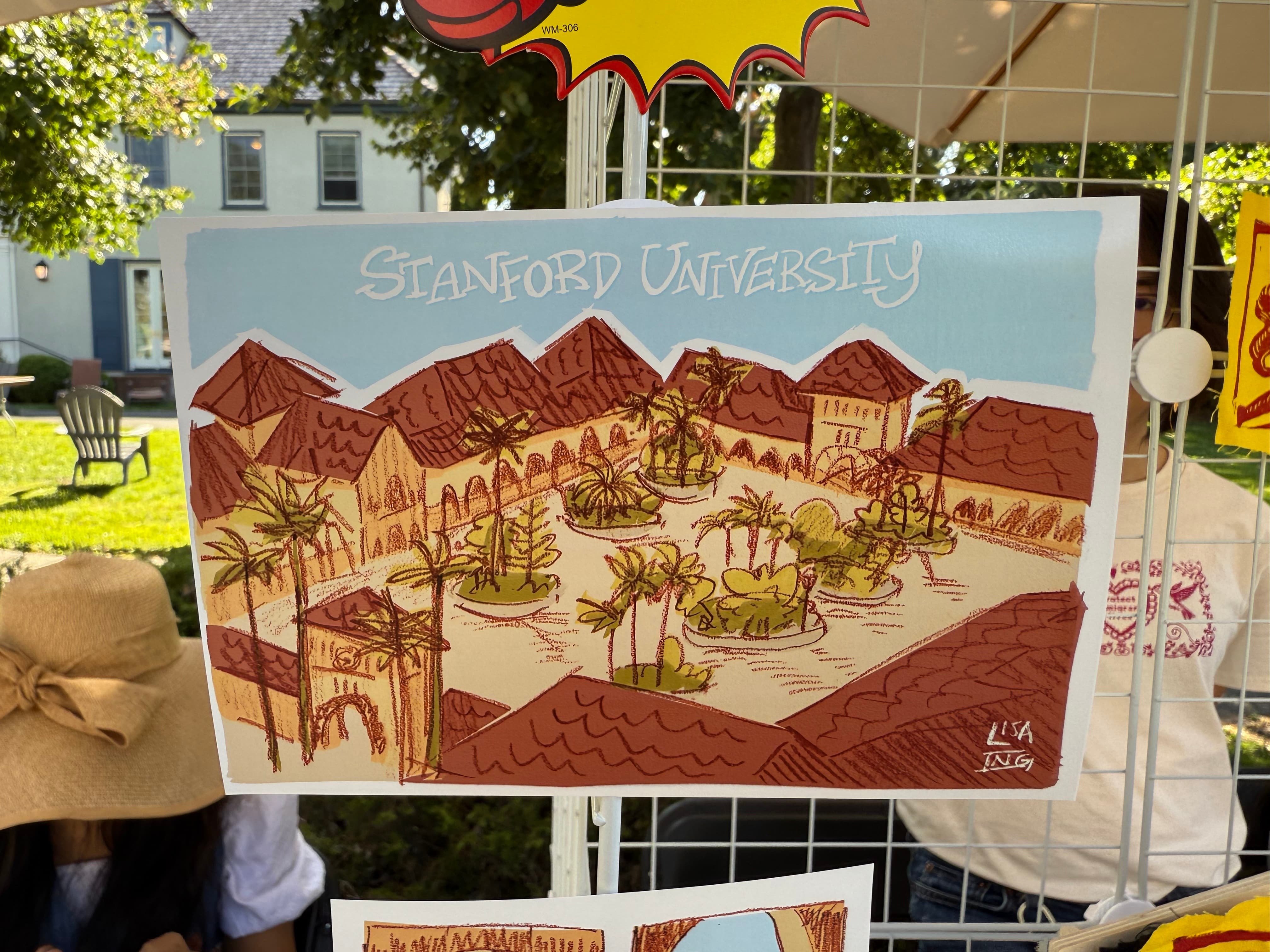
During New Student Orientation (NSO), hundreds of freshmen and transfers from across the globe converge on Stanford’s campus. An essential part of settling in is figuring out where you are. To support this, NSO Coordinator Edith Wu hired a team of students to make a scavenger map of campus. Brenden Koo ’23 drew inspiration from Disneyland.
I viewed Stanford in the same way that I viewed Disneyland. Maybe it’s the tourists frequently roaming campus, but more importantly, Stanford feels like something greater than itself. The campus is not only a hub of academic excellence but also brimming with architectural revelations and the second largest collection of Rodin Sculptures in the world. It is truly beautiful, and I would often joke about how the respective “campuses” (Main Quad, Engineering Quad, Athletic Campus, the Oval, etc.) equate to Disneyland sectors (Fantasyland, Tomorrowland, etc.).
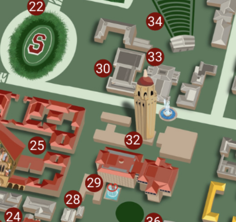
Of course, not every map of the University is curated by the University.
Stanford, for better or worse, is known for its irreverent projects. From the Branner freshmen behind the Octobunk to the aspiring mechanical engineers behind the Motorized Couch, students have pursued ideas that outsiders might view as…exotic.
This was certainly the case for Trees of Stanford. The website is a self-described labor of love. Today, it is used by everyone from the graduate student searching for food on a stipend to the amateur botanist looking to, literally, explore campus life.
In a conversation, Sairus Patel, the lead editor of Trees of Stanford, shared that the project is supported by the Stanford Historical Society. He considers his work documentation, meant to provide data for others to build on.
Notably, the effort is not crowd-sourced. The goal, he clarified, is distinct from a groundskeeper. It is interpretive and historical.
And there is much history to discuss. For a moment, let’s bring ourselves back to the founding of the University. Leland Stanford was a railroad magnate. After Leland Stanford Junior’s death, Leland and Jane founded the University in his honor. The Stanfords found themselves situated in foothills that slowly transitioned to the Santa Cruz Mountains.
Leland Stanford was a farm boy and avid tree lover. He wanted to pay respect to nature and recruited Frederick Law Olmsted. The architect and tycoon engaged in a ‘gentleman’s quarrel’; Olmsted advocated for wilderness and Stanford for curation. Their influences yielded a truly remarkable campus.
Olmsted imagined the campus sitting on a tilted axis aligned with the Knoll and naturally extending into the foothills. He would have his way, at least in part.
The axis has and will continue to shape the University. Palm Drive orients the visitor and Jane Stanford Way (formerly Serra Mall) sets the complement. Meyer Library obstructed a complementary axis, but removing it to form Meyer Green restored it. EVGR was built with respect to the axis. One can even view the quads (e.g., Engineering Quad) as a natural expansion along the throughline.
Of course, Olmsted was not the only person with a lasting influence. Thomas Church, for one, peppered the campus with Red Ironbark. The trees encouraged an Olmstedian tradition of talking with your professor while walking along a shaded path.
There were other nods to Stanford’s vision. David Starr Jordan specified alternating palms (Canary, Fan) to distinguish the West from the East.
The tree lore is rampant and found everywhere from the casual dorm name (e.g., Roble or Encina) to Pulitzer prize-winning fiction.
By the time Sairus was set to graduate in 1992, Stanford had Gerhard Casper as its president. Up to that point, campus maps had been pointed southward. Casper, keeping with common convention, decreed that it should point northward.
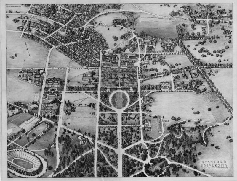
Sairus said the reorientation had a distinctive cognitive effect. When he lived in Santa Fe Avenue or faculty residences near campus, Sairus internalized his position relative to Palo Alto, but when the map switched to north-up, he realized that he was much closer to College Terrace than he imagined. The map influences our understanding of space.
Skipping nearly three decades later, Stanford found itself in lockdown. A fringe outgrowth of the pandemic was Stanford in Minecraft. The idea was straightforward enough: recreate Stanford block-by-block. There is a small but growing history of such projects. A personal favorite is the Uncensored Library, which provides free access to otherwise inaccessible texts across the globe. For Michael Byun ’24, the hope was to engage with a familiar space when access to that space became unavailable.
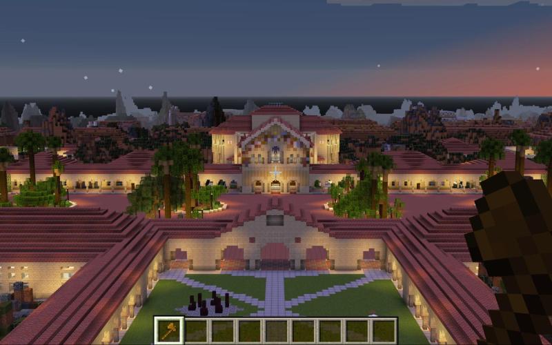
Minecraft imposes a ruleset on its space. The resolution was kept at one-to-one, so one cubic meter of space is one block. The map therefore has its limits — it is a representation of reality, not reality itself. One cannot, for instance, engage with physical sensation in the usual sense. Byun took an interest in this absence:
“What is most obviously missing to me are the people. The Minecraft creation is a physical representation of the space, but it’s eerily empty in some ways. It calls to mind for me the legal concept of terra nullius, famously used to justify colonization. Land that belongs to nobody.
It’s often interpreted in the colonial context as an illegal fiction, but in the case of Minecraft, it is pretty literally true. This blank digital space belongs to nobody and has no history.”
The map may be a simple object, but the simple object is well-suited to recover insight that is otherwise difficult to tease out. To borrow a phrase from theater lecturer Lisa Rowland: creativity thrives under constraint. Here, it was expressed in curatorial decisions.
Memorial Arch historically stood at the front of the Main Quad, but it was destroyed in the 1906 earthquake. On a whim, the team kept the arch, making the decision to replicate something from the past which does not and has not existed for over a century.
Another decision was the choice of material. With the limited palette of Minecraft blocks, one has to carefully choose how to represent asphalt, oaks, lamp posts and more.
Working in Minecraft lets Byun pay attention to the physical space, random corners, landscaping and layout of buildings. Working through it slowly demanded a certain attention that would otherwise be lost.
Rhetoric
Koo, at one level or another, was limited in what he could share as an NSO coordinator. Stanford wants its students to feel that the campus is magical. In passing, I call it the dollhouse effect. The rules and boundaries are clear. The way that we interact with the space is set. It is a modern playground. Why else would Stanford students climb rooftops or build islands in Lake Lag? The space is so safe that we cannot help but bend it and make it our own. Kong reflected:
“Part of why I do it is because it helps me understand the space I’m around. Everyone interacts with this public infrastructure one way or another. Understanding it better and how it serves or does not serve the Stanford population is a public service…Being able to perceive space is a big step in being able to figure out how I can improve it.”
History professor Kären Wigen teaches an introductory seminar titled “HISTORY 95N: Maps in the Modern World.” She argues that it is precisely this desire which underpins our fascination with the map. “A map is a proposition — not just about what is where, but about what should be there…They show us a world that’s much cleaner than the real world…I think maps do seduce us,” she said.
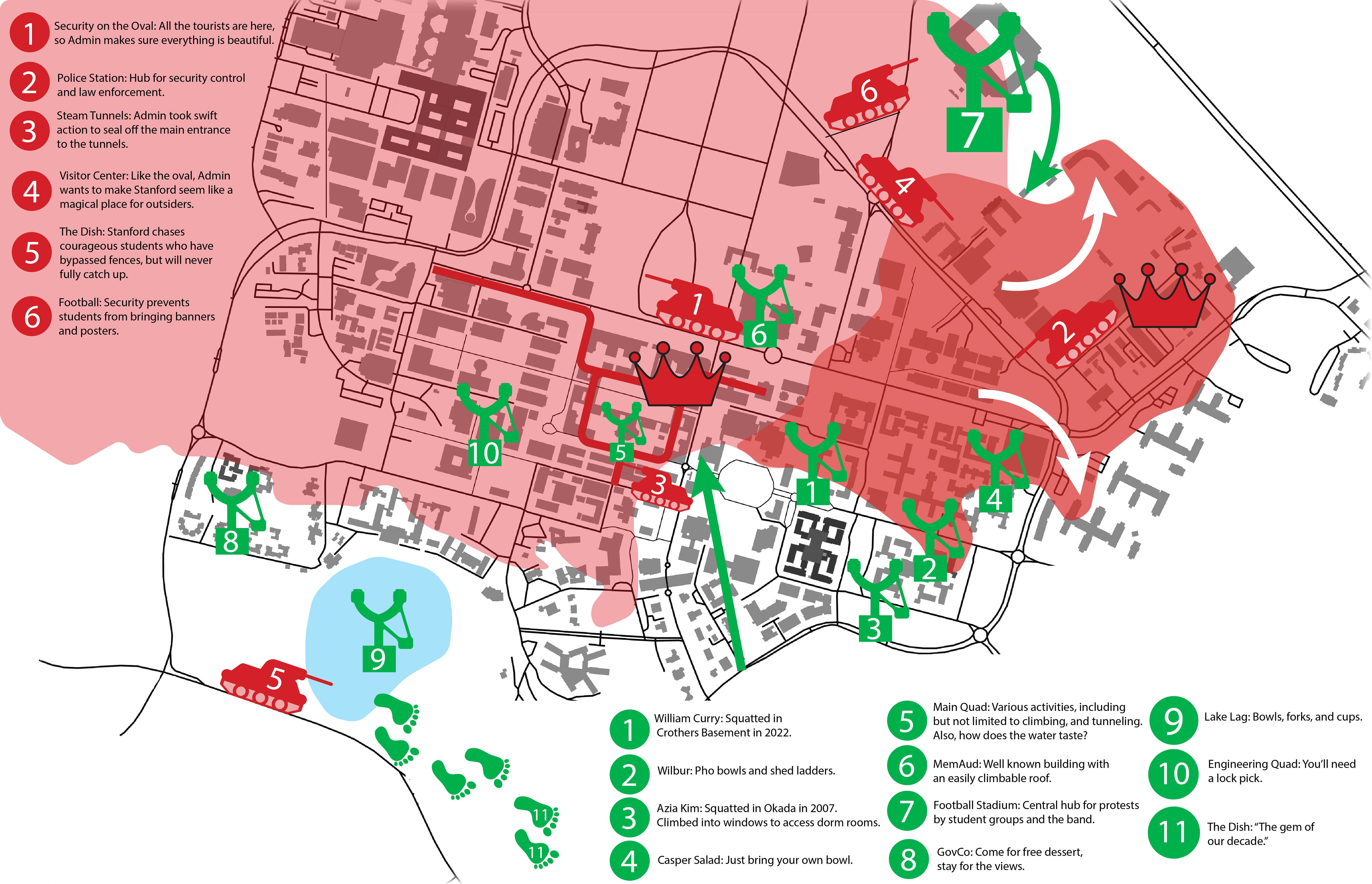
I first encountered the course under an exhibition of over 80 works from the class, curated by Kristen Valenti-McKeen at Green Library. The curator wrote, “A counter-map is any map that the Stanford administration could not make or would not make…They could not make anything that’s grounded in student experience. They don’t have access to that.”
During our conversation, Wigen shared a story from her time at Duke University.
While pursuing her honors thesis, Wigen observed that girls in her cohort were harassed by fraternity boys. They were catcalled outside of their windows and even in the main quad. Wigen never experienced this personally because her apartment was in another part of campus. Fraternities were not on her radar.
“As they told their stories, I realized their map of the campus, their mental map of Duke was completely different from mine, and that I think was the germ of the idea that has gradually evolved into this project where I bring students in and say, you have your own map of Stanford. If there’s a piece of that you want to share, share it.”
The students’ works reflected this. From plotting the spaces where students cry to instances of political activism, the maps brought human connection to an otherwise impersonal landscape.
Kong shared the first maps she connected to: the subway system in urban China. This piece of public infrastructure has a profound impact on residents. It is the connection to people that draws Jessie toward the map:
“Tying things to people’s experiences is a really good way to get people into maps. You can find the most locked-in CS major and they have something to say about how they go from A to B. Because ultimately, no matter what your job is, and no matter how much money you have, you are somewhere. Maps transcend income and social status, because again, everyone’s everywhere.”
To Jessie, a map does not tell us what space is but how it is understood. “I would say [the map] is an argument about how space is perceived,” she said.
Consider a simple example. You are designing a map of Terman Fountain but decide that you don’t like a tree with a certain leaf, and so you drop it. That decision, arbitrary as it may be, was perfectly legitimate. “If someone makes a map of what they see as campus, that is automatically a valid perspective. My bottom line is, everyone has something to contribute because no map is exactly what I see of the world,” Jessie explained.
The map, I realize, is an especially fuzzy sort of thing. If I were to hazard a definition, I would say it acts as a conceptual anchor, a general description for the organizing principles that we perceive in the world around us.