
Editor’s Note: This article is a review and contains subjective thoughts, opinions and critiques.
As both a desk editor for The Daily and the daughter of a Cal alum, I often find myself conducting research (snooping) on our greatest journalistic rival — Berkeley’s independent student newspaper, The Daily Californian.
Aside from oddly similar names, our newspapers share common history: Though The Daily Cal was founded 21 years before The Daily in 1871, the two papers gained institutional independence just 2 years apart in the 1970s. Their rivalry went digital in 1995, when The Daily and The Daily Cal created their respective websites.
Recently, certain individuals (my mom) have claimed that The Daily Cal is almost as good as The Daily. That bold assertion demands scrutiny and analysis. While The Daily Cal also publishes in print, I sadly couldn’t get my hands on an issue. So I had to test my mom’s claim on a single (admittedly narrow) front: The Daily’s website versus The Daily Cal’s.
I analyzed each website using a five-category system: general website design, the home page, multimedia and each paper’s respective magazine. Note: I did not assess the written content of each newspaper. (That’s best left for another review.)
Website design
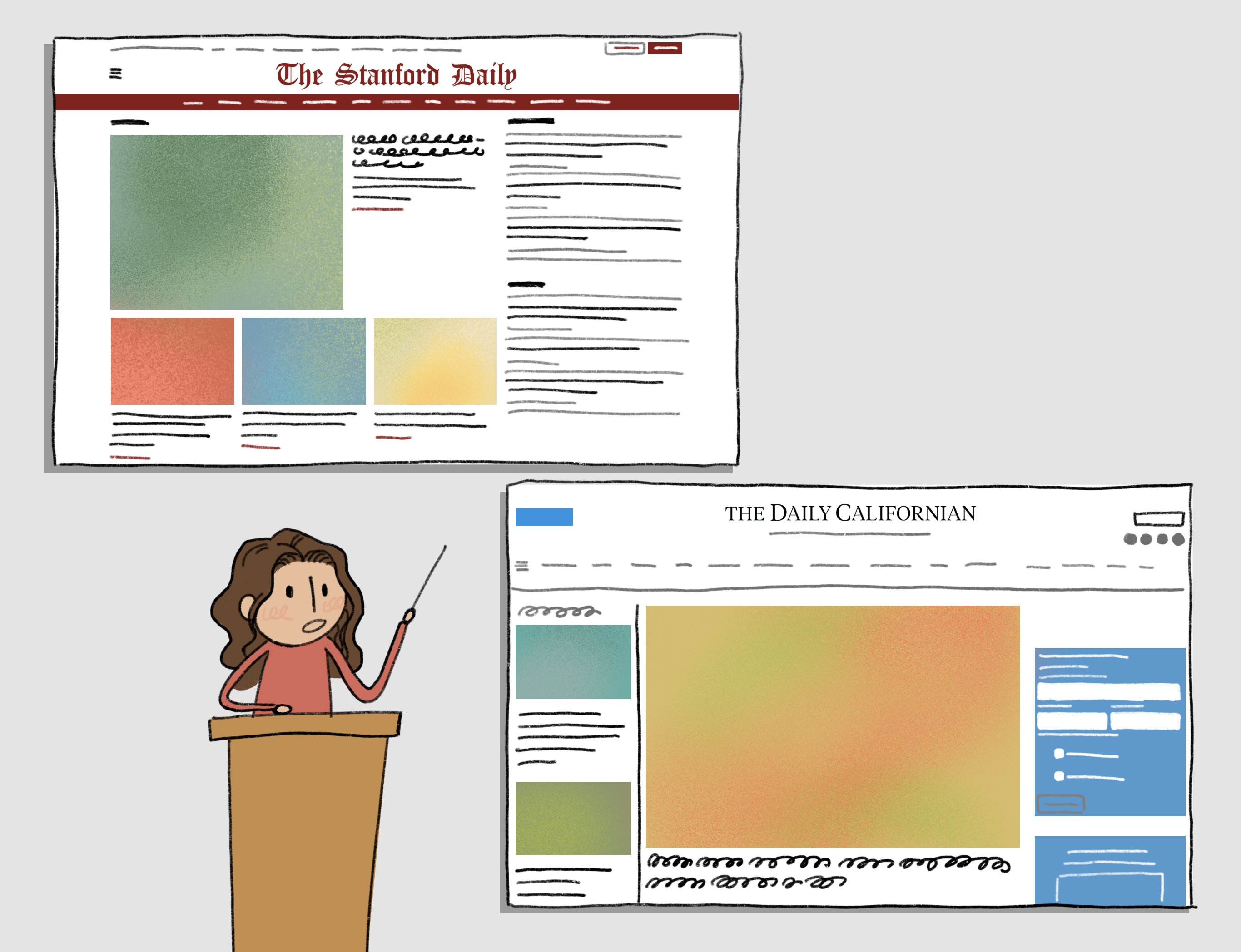
The Daily’s website is beautiful and easy to navigate. The bold masthead commands attention and the combination of black, white and red looks professional and refined. The site leaves wide margins on either side, perhaps sacrificing valuable screen real estate. Then again, those margins echo the proportions of a printed broadsheet. It’s a thoughtful and nostalgic design choice … if a tad impractical.
With its crisp typography, The Daily Cal’s website is also pleasing to the eye. However, its real power lies in its usability: the search bar is never out of sight. From an aesthetic standpoint, however, the website has some flaws. The light gray font on white background forces the reader to squint, and the only sources of color to be found are the “Support” and “Sign Up” buttons. Puzzlingly, The Daily Cal also forgoes incorporating Cal’s school colors, Berkeley Blue and California Gold, opting instead for light blue. Come on, Cal — where’s the school spirit?
Homepage
The Daily Cal’s homepage features a gallery at the center of the page that shifts through new articles for students to read. Meanwhile, the right margin and the gaps between articles are filled with advertisements for AI and hair growth companies — a telling reflection of the Bay Area’s obsession with tech and lifestyle optimization. The Daily’s homepage isn’t too different. While there are occasional advertisements for financial corporations and car companies, almost all of them can be closed, (rightfully) lending more focus to actual articles.
Articles
To evaluate how articles were displayed on the website (not each piece’s journalistic quality), I assessed the appearance of the first 30 visible articles. For The Daily Cal, the first articles presented to me were all University, City or Sports news. The Daily, by contrast, offers up Arts & Life and Opinions pieces in addition to News and Sports. There’s also a section dedicated to highlighting “most-read” articles.
While both papers appropriately center their News section, The Daily appears to give a larger platform to student voices, campus culture and reader favorites. Meanwhile, The Daily Cal seems to prioritize “hard news.” Whether this makes Stanford students more expressive or simply more opinionated is unclear.
Multimedia
The Daily Cal and The Daily’s multimedia both set a high bar for other student papers.
Across sections, both newsrooms pair articles with high-quality original photography. Of course, neither’s multimedia is flawless. Some images fall through the cracks — an overly-compressed file here, an odd angle there.
I must admit, however, that The Daily Cal’s photographs were slightly more consistent than The Daily’s. They have an entire photo essay section! But The Daily wins on graphics. We use them more frequently overall, with our incredible graphics team serving up clean-lined, boldly-colored illustrations that enhance everything from film reviews to philosophical analyses. (Just look at this illustration of a modernized Bourdieu!)
Magazine
Both papers publish a separate biannual magazine.
On The Daily’s website, the magazine is simply another tab, while The Daily Cal’s magazine (“Stacks”) links to an entirely separate site. Its online presence is elegant, even avant-garde: Open the website, and an animated black spiral sweeps you into a page filled with handwritten typography and black-and-red accents.
The Daily Cal prevails here.
Who gets the crown?
Honestly, I’m still undecided. But I conclude this investigation with a newfound, if begrudging, appreciation for The Daily Californian’s website. The Stanford Daily’s classic design is hard to beat, but The Daily Cal’s excellent photography and effortless navigation make this contest closer than I’d like to admit.
The best thing The Daily and The Daily Cal can do is learn from each other. Cardinal red or Berkeley blue, The Daily and The Daily Californian share a common color: the noble black of newspaper ink. As organizations committed to independent student journalism, we have a duty to support each other — hence our annual collaborative Big Game issue.
That being said … the Axe still looks best in red.