Spread along five walls in the Freidenrich Family Gallery, “Word as Image,” the newest addition to Stanford’s Cantor Arts Center, showcases 12 pieces, each using words not as a spoken language, but as the visuals themselves.
“Hollywood” (1968) by Edward Ruscha on screenprint is the essence of what Hollywood is; the word “Hollywood” is spelled out on a black hill against a red-orange and crimson background. The colors blend into a sunset and the simple use of diminishing perspective inspires longing for the legendary entertainment district. At the same time, it captures the elusive glamour of Hollywood.
Pablo Picasso’s “The Ostrich” (1936) is drawn with basic lines using aquatint and drypoint. Originally, it was used as a sketch for Georges-Louis Leclerc’s “L’Histoire Naturelle,” though Picasso renders the ostrich with childlike amateurism complete with crooked borders and a scratchy signature. Studying this piece, I was drawn back to my youth. The simplicity is familiar and Picasso’s animal so easily takes on the lifelike quality once known only to my drawings.
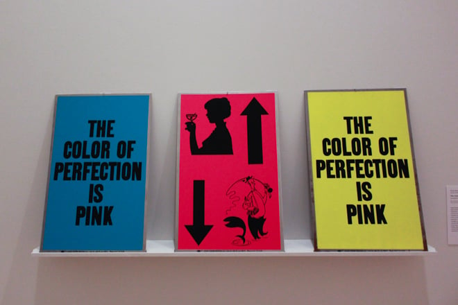
“The Color of Pink” (1988) by Allen Ruppersberg presents three aluminum lead panels with simply phrased sentences. “The Color Of Perfection Is Pink” is printed once on a blue panel and once on a yellow panel. The middle panel is pink with cartoon-like images of a man with a downwards arrow and a woman with an upwards arrow. Somehow, this piece uses familiar images and words in a strange way to explore opposites. The arrows pull in two different directions, like the man and woman. Similarly, “The Color Of Perfection Is Pink” is not printed on red or purple as expected, but blue and yellow.
In “No” (1969), Jasper Johns uses lead and embossing to create a large-scale lithograph. The word “No” is cut from lead and appears to hang from a piece brown string. In reality, John’s use of color contrast and shadows provides the illusion of real string. In comparison to his earlier works, “No” is much gloomier and symbolizes a turning point. The background is composed of random gray scribbles and the word “No” is lost among them. “No” seems powerless and fragile despite its supposed strength and offers a whole new perspective of the word. The lithograph seems desperate, as if its last piece of hope is dangling from that thin string.
Bruce Nauman’s lithograph, “Raw-War” (1971), is a play on words and palindromes. “War” is written three times on three parallel lines. Each time, “war” becomes more and more visible until finally, Nauman writes the first word in red. The “R” is backwards so that the image reads both “war” and “raw.” The red screams out pain and tension, as if to scorn those who do not fully understand the harsh reality of these three letters.
The second Nauman lithograph on display, “Pay Attention” (1973), is a powerful piece. Four words appear in bold while printed backwards: “Pay Attention Mother Fuckers.” It is such a straightforward sentence, but also so honest that that it takes a few minutes for the full meaning to sink in. The letters are large and crude, seemingly fighting for space, pushing against the boundaries of the lithograph. The way the piece is put together undoubtedly succeeds in what the title asks. Although the piece may seem to be asking for attention, once viewers really study the work, a sense of claustrophobia emerges from within the words.
“Word as Image” is a simple yet unforgettable showcase in which featured artists transform words into images that are capable of expressing ideas and emotions — allowing text to take its place as an important part of modern art.
Contact Emma Chiao at emma1cor1348 ‘at’ gmail.com.
